September 3, 2024
From its inception in the Spring of 1996 to the Fall of 2024, a period of 28 years, my portfolio grew at the fairly astonishing rate of 33% a year. That’s enough to double your money every 2 and a half years. If my portfolio had been a mutual fund and an investor had put in $10,000 at the beginning of that run and had had the restraint not to take any money out along the way (sadly, I haven’t been able to show the same restraint) they would have seen their money grow to just over $34 million 28 years later. I’ve beaten the market, often by a wide margin, in 23 out of those 28 years. This kind of track record outperforms almost every mutual fund, hedge fund, professional money manager or investment newsletter in existance.
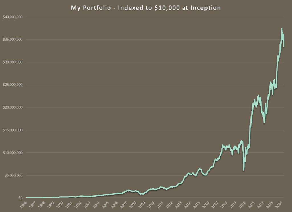
But those numbers and the graph above are perhaps a little misleading. Whenever you graph an exponential function on a regular chart, it can end up looking like a rocket ship taking off, especially if the annual gains are quite high. This is the magic of compounding interest. At the beginning of the graph above, a 100% rise barely registers, as $10 000 turns into $20 000. But towards the end of the series, a 100% gain takes you from $10 million to $20 million.
A better way to visualize what’s going on is to draw the same graph using a logarithmic scale, which makes equal percentage moves show up as equal vertical changes on the graph. Using this kind of scale makes a 100% increase look the same, regardless of whether it be from a $10 000 starting point or a $10 million one.
Here is my same performance graph, plotted on a logarithmic scale. This picture tells a somewhat different story.
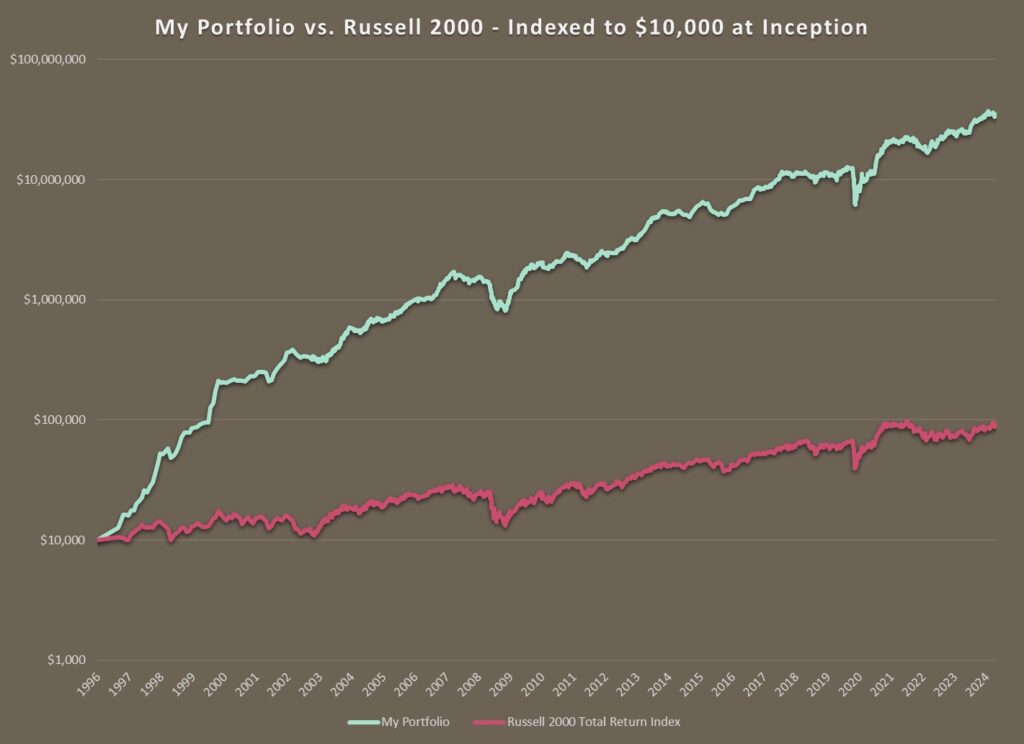
As you can see from the graph above, my investing career started off with a bang. Those first 4 years, from 1996 to the peak of the internet bubble were a great time to be an investor. The economy was strong and there were scores of small, rapidly growing, profitable companies to choose from. People were quitting their jobs to become day traders, spending their days glued to their screens, chasing each other into and out of the hot stock of the moment. While their activities mostly centered on the technology sector, their enthusiasm bubbled over from time to time into my overlooked corners of the economy.
Back in those days, my portfolio was very small. I was nimble and highly concentrated in a handful of stocks. Distracted by promises of internet riches, investors were ignoring vast swathes of the market. As a result, there were plenty of exciting “old economy” companies whose stocks were trading at very reasonable prices. Frozen yogurt, call center software, dollar stores, surveillance cameras, home exercise equipment. I was finding lots of opportunities and the portfolio grew very quickly. A couple of big home runs (most notably, massive gains in Bowflex and Total Telcom) certainly did not hurt either.
By the time the market peaked in the winter of 2000, my portfolio had matured. I was more diversified and the portfolio was larger. Thanks to the windfall profits from the late 90’s boom, I had managed to grow enough of a nest egg that I could afford to say goodbye to the daily grind and let my portfolio do the heavy lifting for me.
Here is my same performance graph, but this time I’ve started it from the peak of the market in early 2000.
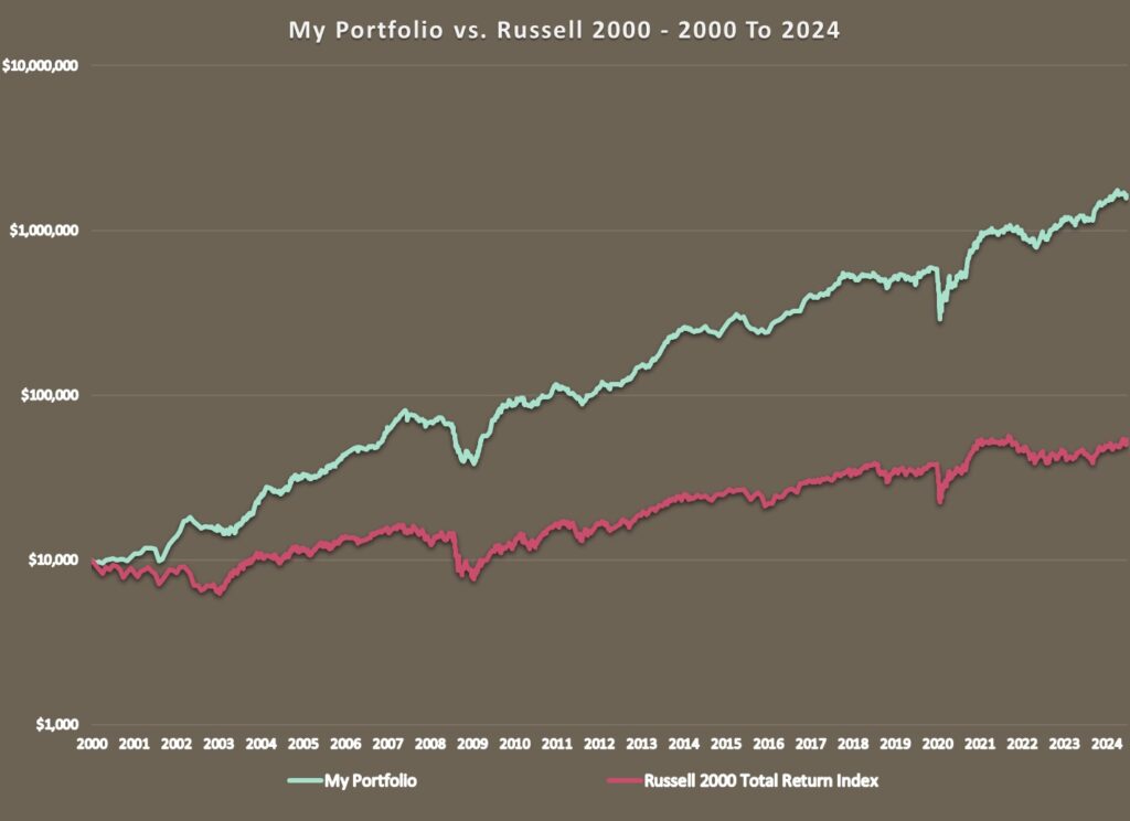
The years immediately following the bursting of the internet bubble were good ones for value investors as the technology stocks which had been lording it over the rest of the market imploded while the more traditionally value-oriented old economy stocks took their turn to shine. My portfolio neatly sidestepped the bursting of the internet bubble and continued to prosper in the early years of the new millennium.
Then the Great Financial Crisis hit and something shifted in the markets. After outperforming for most of the preceding 100 years, low-priced value stocks took a breather. We are now 17 years into the longest stretch of relative underperformance by value on record. Many famous value investors have fallen by the wayside. I am pleased to report that for the moment, I am still standing. If you look closely enough at the graph above or at my list of annual returns in the appendix below, you can see that my average rate of return inflected moderately lower starting from the beginning of the Great Financial Crisis in 2008. While I hold out hope that one day value stocks will again gain the upper hand, for the moment I am content with the slightly lower but still market beating returns that a disciplined, value-oriented approach has been able to achieve in a stock market that is obsessed with the latest and greatest.
Over the past 15 years, I have enjoyed an average annual rate of return of 23%. (Not quite the 33% return since inception, but still very respectable.) Over the same time period, the Russell 2000 has grown by 11% per year. Which means I have outperformed my benchmark index by a whopping 12% annually. The same holds true even when I look at more recent performance. So far, the train is not showing any signs of slowing down.
That is quite a gratifying performance and should put paid to any lingering doubts I had about the validity of my value-oriented approach. However, the market sands are constantly shifting under my feet and I never get too complacent.
I have had stretches of weaker performance, usually around recessions or economic slowdowns. During major market declines like we experienced in 2008 and 2020, my portfolio has tended to drop right alongside the market. While I wish it were otherwise, cheap just seems to get cheaper in times like these. It is often only in the aftermath that my value stocks truly shine and make up for lost ground.
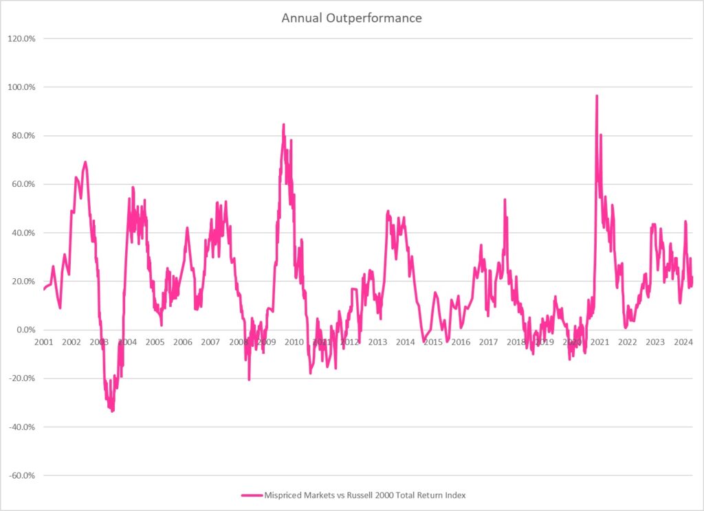
Below is a graph of my annual outperformance over the last 23 years against the Russell 2000 Total Return Index of small cap stocks.
Finally, to be completely transparent about everything, my performance numbers are for my stock portfolio only. From time to time, depending on how nervous I’ve felt, I’ve dabbled in put options on the S&P 500 or built up a pile of cash on the side. Any gains or losses from these activities have not been included in my portfolio results.
Apart from the occasional misguided foray into various hedging strategies, my portfolio has always been made up entirely of a concentrated basket of hand-picked, undervalued, mostly smaller company stocks. Although more recently, as my portfolio has grown in size, I’ve been forced to move up the market cap spectrum. Canada is my home market and until recently always formed the core of my portfolio, but I’ve ventured abroad at times, investing in Hong Kong, the UK and lately, the US. Through those exchanges I’ve owned companies that were even more far flung. An unfortunate purchase of a Ukrainian egg farming company, just before hostilities broke out in that country, springs to mind. Regardless of which market I find myself in or which market cap segment I chose to focus on, I find that the same universal value principles apply and I seem to enjoy similar levels of outperformance.
I’ve always followed a basic, value-oriented investment discipline. I seek out fundamentally sound companies that are profitable or have a history of profitability and are trading at a low price relative to those earnings. I eschew companies that are carrying too much debt and I like to seek out companies that seem to have a credible plan for the future. This leaves the field pretty wide open to consider all manner of potential investments.
While I’ve had the occasional bigger successes, most of my gains have come from a steady stream of 50%, 100% or 200% gainers. I’ve run a concentrated portfolio by mutual fund standards but not so concentrated that one investment could make or break the portfolio. I’ll typically own between 8 and 15 stocks in a variety of industries and not infrequently from a variety of countries. I gravitate towards small cap stocks but as my portfolio has grown, I find myself moving more into the mid and even large cap end of the spectrum.
I’ve loved the thrill of discovering hidden value in all the far-flung corners of the market. From lighting fixtures to industrial abrasives. From struggling clothing retailers to software resellers. From lumber distributors to vaccines for fish farming. If it’s cheap, I’ll buy it.
I don’t trade that often. In any given year I might buy a handful of new stocks and sell a handful of older ones. I’ll often hold stocks for a year or two or three at a time. I’m in no rush. When I find a good value, I’ll stick with it until eventually the rest of the market sees what I see. It doesn’t always happen, but it happens often enough that it keeps the lights on.
Past performance is no guarantee of future results. Despite the bursting of the internet bubble, the gut-wrenching declines of 2008 and 2020 and the sluggish economic recovery of the 2010s, for investors, the wind has basically been at our backs for the last 28 years as the market has come back from every downturn and gone on to set new highs. That wind will change direction at some point, and it remains to be seen how a disciplined, bottom up, value-oriented approach like mine will fare in that circumstance. It is easy at times to become pessimistic about the future trajectory of markets. But I subscribe to the notion that the best defense is a good offense and I am hopeful that even in a tough market environment, my value discipline will allow me to outperform the overall market and hopefully generate a positive return.
And if, per chance, the bottom does not fall out of the market then the future looks bright.
Appendix
In the Portfolio Archive section of this website, you’ll find a list of all my stock holdings going back to the beginning of time in the spring of 1996 when I purchased my first two securities. Lots of details in there, if you’re interested, including the length of time I held each stock and my gain or loss from each sale.
And below is a table showing a full list of my annual results and how they compare to the Russell 2000 Total Return Index…
| My Portfolio | Russell 2000 TR | Outperformance | |
| 1996 | 44.7% | 8.5% | 36.3% |
| 1997 | 120.1% | 22.4% | 97.8% |
| 1998 | 159.1% | -2.5% | 161.6% |
| 1999 | 90.5% | 21.3% | 69.2% |
| 2000 | 51.1% | -3.0% | 54.1% |
| 2001 | 26.4% | 2.5% | 23.9% |
| 2002 | 26.4% | -20.5% | 46.9% |
| 2003 | 27.3% | 47.3% | -19.9% |
| 2004 | 61.1% | 18.3% | 42.9% |
| 2005 | 25.0% | 4.6% | 20.4% |
| 2006 | 27.8% | 18.3% | 9.5% |
| 2007 | 35.3% | -1.6% | 36.8% |
| 2008 | -38.4% | -33.7% | -4.7% |
| 2009 | 107.0% | 27.2% | 79.8% |
| 2010 | 12.3% | 26.9% | -14.6% |
| 2011 | 1.1% | -4.2% | 5.3% |
| 2012 | 36.0% | 16.3% | 19.7% |
| 2013 | 68.1% | 38.8% | 29.2% |
| 2014 | -0.9% | 4.0% | -4.9% |
| 2015 | 8.9% | -3.6% | 12.5% |
| 2016 | 47.4% | 21.2% | 26.2% |
| 2017 | 45.1% | 16.1% | 29.0% |
| 2018 | -13.1% | -11.9% | -1.1% |
| 2019 | 27.9% | 25.6% | 2.3% |
| 2020 | 26.7% | 20.0% | 6.7% |
| 2021 | 35.6% | 14.8% | 20.8% |
| 2022 | 2.7% | -20.4% | 23.1% |
| 2023 | 41.3% | 16.9% | 24.4% |