5 countries go head to head in a global showdown. Amidst a flurry of p:e ratios, revenue growth rates, book values and more, the markets duke it out. When the dust settles, will one market reign supreme?
The Contenders
I’ve been playing around lately with my new favourite toy: the wealth of fundamental data provided by the GuruFocus website. This time, I wanted to look at how various stock markets around the world compare on a handful of basic valuation measures. Is there a clear winner? Are stocks indeed cheaper on the other side of the pond? And how do the markets compare from one country to the next?
For this exercise, I focused on 5 of the world’s most prominent markets: the United States, the UK, Japan, Hong Kong and Canada. (There aren’t many of us Canadians, but our markets seem to pack a reasonably big global punch.) For an excellent visual rendering of the world’s stock markets by size, check out this graphic from the visual capitalist.
A big roadblock to effectively comparing different markets lies in the difficulty of creating a proper apples to apples comparison. A few years ago, when China first started slowing down and commodity prices collapsed, many of the countries that had benefitted from the resource boom (like Canada, Australia, Brazil and Russia), looked cheap when comparing their average p:e ratios to other countries that weren’t so resource focused. In large part, however, this was due to the low p:e ratios of the resource stocks found within these markets and not a reflection of the overall market. If you looked at the non-commodity sectors in these countries, prices weren’t necessarily that much cheaper than anywhere else.
A similar phenomenon can often be seen with financial services stocks. Many of the smaller markets are dominated by their big banks. When Greece started making headlines back in the early 2010’s, I went looking at the Greek stock market to see if there might be some good bottom fishing opportunities there. The quoted p:e ratio of the Greek market was extremely low, well into the single digits, so it seemed reasonable to expect that there would be many value-priced Greek companies up for sale. But the Greek stock index was very heavily weighted towards its big, national banks which were on the edge of insolvency, and these were dragging down the market weighted p:e average of the entire index. When I looked at a variety of still-healthy Greek companies (in manufacturing, retailing and shipping), the p:e ratios were much higher and did not seem to offer much of a discount to what I could find here at home in Canada.
So to make a proper comparison between the stock markets of the 5 countries mentioned above, I wanted to try and slice and dice the data to make the comparison as meaningful as possible.
I started out by excluding all resource companies (energy and basic materials), all financial services companies and any company in the real estate sector. Companies in these sectors are often not valued on the basis of their current earnings. With resource companies, commodity prices, mine life, political risks and ore grades play a much more prominent role than simple trailing earnings do. Companies in the real estate sector are more typically priced off of the underlying value of their real estate assets and financial services companies are evaluated on the strength, or lack thereof, of their balance sheets.
What I wanted to do was compare the price of a typical operating company across different markets. Things like retailers, manufacturers or technology companies, where the current level of sales and earnings might give a reasonable indication of the company’s approximate value.
Next up, I muscled each country’s data into different market cap size categories. Some countries have a larger preponderance of smaller companies while others (the US) have a bigger selection of larger, more established companies. Small stocks often come with lower p:e ratios, so a market heavily weighted towards smaller companies might have a lower average p:e simply because of this skew towards more volatile, early stage enterprises.
I excluded all stocks with market caps of less than $50 M, again to try to keep the confounding effects of smaller, more volatile stocks to a minimum. I then divided the market up into four different market cap categories (micro cap ($50M – $300M), small cap ($300M – $1B), mid cap ($1B – $5B) and large cap (>$5B)) and calculated median valuation numbers for each category. I used the median here instead of the average because I wanted to know what the typical stock was trading at. Averages can be skewed up or down wildly by a few extreme outliers. Using the median, equally weights all participants. If the median p:e ratio of all Canadian micro cap stocks were 20.7, for example, it would mean that half of the 147 stocks in this group had a p:e ratio above 20.7 and half had a p:e ratio below 20.7. The fact that a few high flying technology stocks might sport p:e ratios well into the hundreds won’t affect this median reading significantly.
Finally, after calculating median results for all the ratios I was interested in, I mashed all the readings back together again by taking the equally weighted average from all four market cap categories to arrive at an average reading for the market as a whole. I added up the median ratio in each of the four market cap segments and divided that result by 4. Doing this meant that I wasn’t overweighting the contribution from lower priced micro cap stocks in those markets, like Canada’s, that have an overabundance of these sorts of companies.
I only included stocks in the calculation of each ratio if GuruFocus had the relevant data for that stock. If a company was losing money, it wouldn’t have a meaningful p:e ratio, for example, and was not included in the determination of the median p:e. When calculating the median debt to earnings ratio, I calculated “net debt” as total cash and marketable securities minus total debt. Japanese companies, on the whole, actually have more cash than debt so their debt:earnings ratio is actually a cash:earnings ratio. (The Japanese government seems to be doing its best to make up for the austere attitude of its corporations by racking up the highest indebtedness of any developed country. Where does that leave investors? Do you applaud Japanese companies for their tight fisted ways or do you run away in terror from their government’s profligacy? Tough call.)
Before I get to the actual results, one word of caution: while I have tried to put together a comparable series of data, no two markets are completely alike. There are many considerations, such as the relative valuations of the countries’ respective currencies or the overweighting of a given sector, that make simplistic comparisons unreliable. As well, the overall sample sizes can be small. For example, in Canada, there are only 74 stocks which fall into the small cap bucket once you exclude our many resource companies, numerous REITs, and dodgy mortgage lenders. With only 74 stocks, one sector, such as say, cannabis, could have an outsized effect even on median results. (So far these cannabis companies are mostly unprofitable so wouldn’t be showing up in the earnings-based numbers yet. They might be skewing p:b and p:sales ratios upwards, though.)
The Results Are In
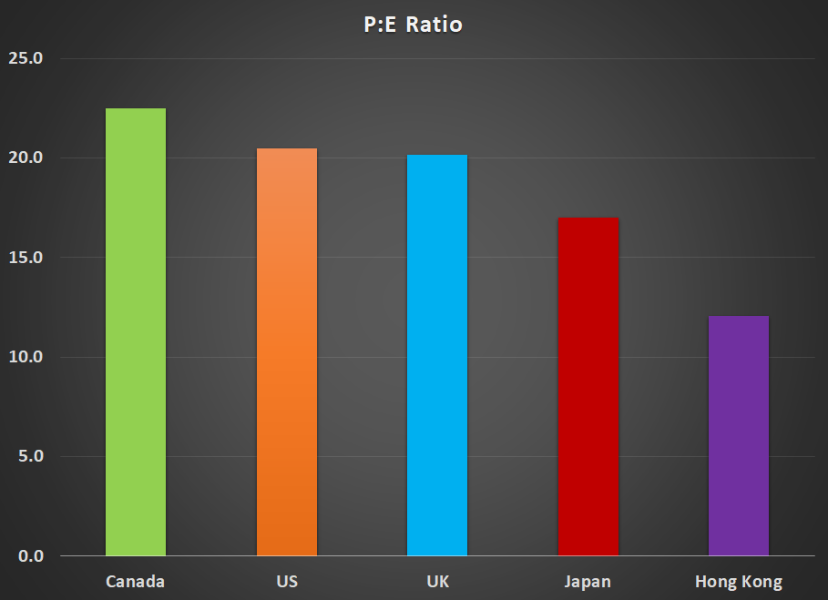
So after all of this number crunching what did I find? Surprisingly, despite the phenomenal performance of the US market over this business cycle, this is not the most expensive of the 5 markets I looked at. That dubious distinction goes to my own home market of Canada. The US and the UK are closely tied for second place. Japan comes in next, offering a slightly cheaper alternative and Hong Kong comes out as the hands-down winner of this particular horse race, offering the lowest overall p:e ratios. On a simple, trailing 12 month p:e basis, using as reported earnings, Canada sported a p:e ratio of 22, the US and UK had p:e’s of 20, Japan came in at 17 and Hong Kong had an intriguingly low p:e ratio of 12.
The devil is in the details, as they say, and digging a bit further into the data provides some further interesting insights…
Trailing 12 Month P:E Ratios
| Canada | US | UK | Japan | Hong Kong |
| 22.5 | 20.5 | 20.2 | 17.0 | 12.1 |
Debt Levels
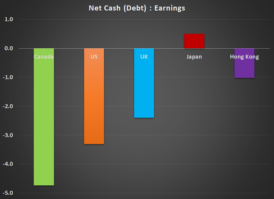
No consideration of p:e ratios is complete without taking debt levels into account. Typically, companies with high debt (leverage) will get penalized by the market on the p:e front. Here, Canada is the big loser with the typical company carrying a debt load equal to nearly 5 times annual earnings. That makes our high p:e ratios look even scarier. Despite the worry about using borrowed money to fund endless stock buybacks, the overall leverage ratio in the US doesn’t look quite as bad, with the typical company there having a debt to earnings ratio of 3 to 1 (the upper limit of what I usually consider acceptable in my own personal investing). Japan and Hong Kong both come out looking quite good on this measure with Japanese companies actually boasting an overall net cash balance on their books.
| Canada | US | UK | Japan | Hong Kong |
| -4.7 | -3.3 | -2.4 | 0.5 | -1.0 |
Growth Rates
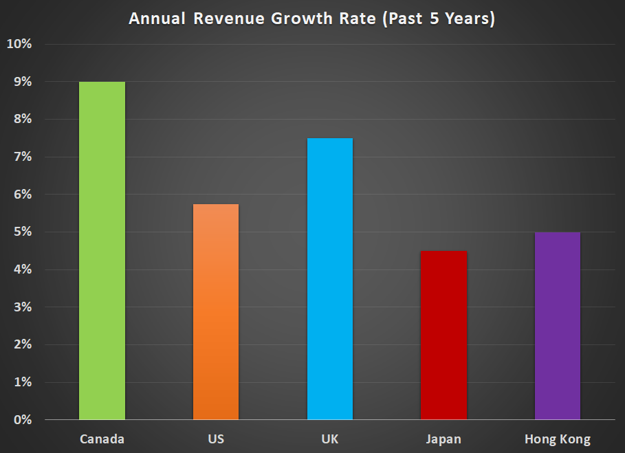
Another key component of any equity valuation is the expected growth rate. If we turn our attention towards sales, we see that annual sales growth has been fairly standard over the past 5 years. Here at least is one area where Canada has slightly outperformed.
| Canada | US | UK | Japan | Hong Kong |
| 9% | 6% | 8% | 5% | 5% |
Return On Equity
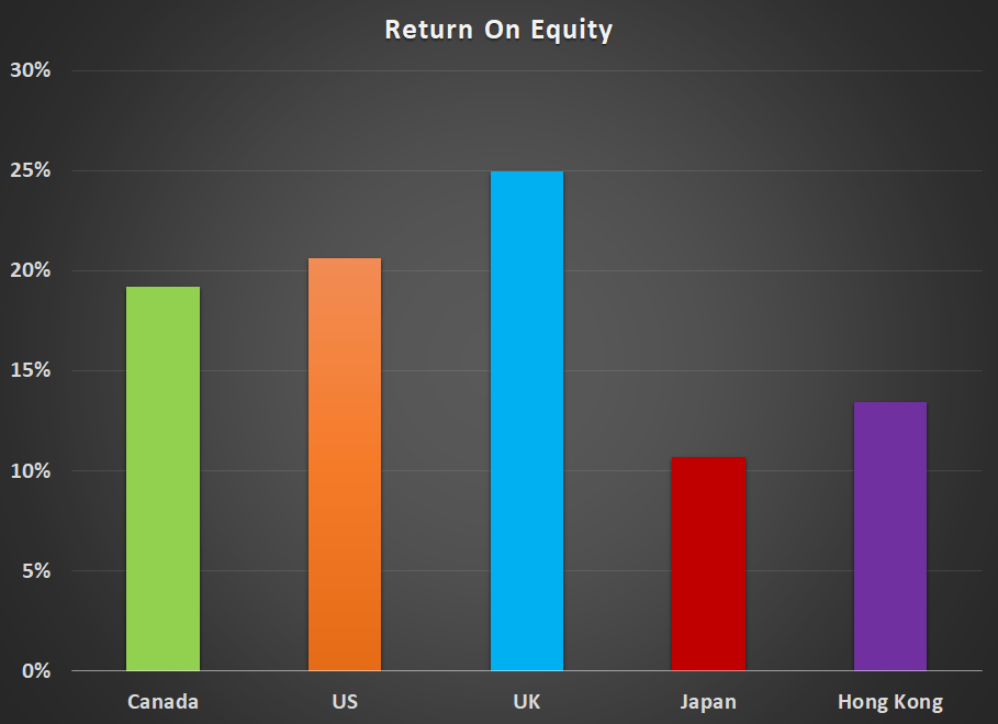
To put things into a little more context, I also calculated the return on equity for each company, using as reported, trailing 12 month earnings and tangible book value (only hard, physical assets allowed; none of that airy-fairy goodwill stuff). To a certain extent, it seems like the higher p:e ratios in the west might be somewhat justified by the higher returns on equity. But only if companies are using these profits to reinvest in equally productive capital, fuelling future growth. For most of this current business cycle, that doesn’t seem to have been the case.
| Canada | US | UK | Japan | Hong Kong |
| 19% | 21% | 25% | 11% | 13% |
Profit Margins
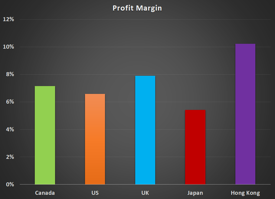
Profit margins were fairly evenly spread out amongst the different markets. There has been a lot of hand-wringing over profit margins and how unsustainably high they are on a historical basis. Evidently, this is a worldwide phenomenon (although Japan is trailing a bit in this regard).
| Canada | US | UK | Japan | Hong Kong |
| 7% | 7% | 8% | 5% | 10% |
Tax Rates
Valuing the US market using trailing p:e ratios has been a little tricky over the past year as Trump’s tax cuts roll through the market. For the most part, the data I used for this survey covers the 12 month period ending in Q2, 2018. So it includes roughly two quarters of the tax cuts. Perhaps if you did the same survey in another 6 months’ time, trailing earnings would benefit some more from a full year’s worth of tax cuts, making the US market look a little cheaper.
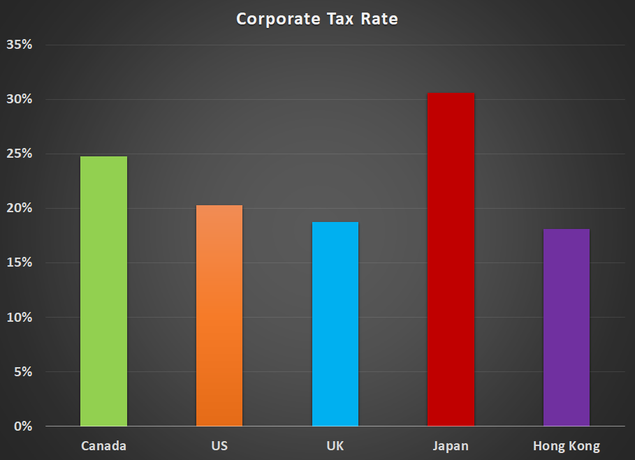
Here are the observed median tax rates for each country, calculated by taking the median of the actual tax rate paid by each company in the latest 12 month reporting period.
The US, UK and Hong Kong now all enjoy fairly competitive corporate tax rates while Canada is falling behind in this game and Japan is bringing up the rear.
| Canada | US | UK | Japan | Hong Kong |
| 25% | 20% | 19% | 31% | 18% |
Price To Sales
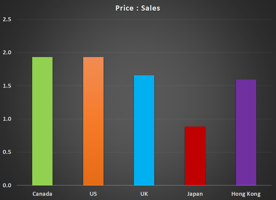
For what it’s worth, price:sales ratios are pretty consistent across the board with Japan standing out as the outlier. (In a good way.)
| Canada | US | UK | Japan | Hong Kong |
| 1.9 | 1.9 | 1.7 | 0.9 | 1.6 |
Price To Book Value
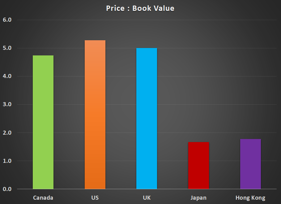
And finally, we have good old tangible book value. When your earnings evaporate in the next recession, the value of your factories and the land they sit on, the value of your machinery and equipment, the cash you have socked away in the bank and the receivables you haven’t collected on yet can be awfully comforting. Western markets don’t look very secure here with average p:b ratios of 5. The two Asian markets look like they have a sturdier foundation with p:b ratios under 2.
| Canada | US | UK | Japan | Hong Kong |
| 4.7 | 5.3 | 5.0 | 1.7 | 1.8 |
Conclusions
So what, if anything can we take away from all of this? As a Canadian investor, I can’t say that I find these results particularly reassuring. Canada comes away looking like the ugly duckling of the group. Stock prices here are the most overvalued using a simple p:e comparison and debt levels are also the most extreme. The average return on equity of our companies lags the US and the UK and tax rates are significantly higher. Perhaps it is time to look further afield for new investing opportunities.
I’ve invested in the UK in the past and was wondering, with the uncertainty of Brexit looming over its head, if the stock market there might be offering up some compelling opportunities. While the UK scores a bit lower on a few measures, it doesn’t seem to offer enough of a discount to the larger and more easily accessible US market to make it worthwhile dusting off my old UK spreadsheets again.
Despite the impressive ascent of the US market, valuations there are modestly lower than what you are seeing in Canada. But to really find the potential bargains, it looks like we have to travel to the other side of the world. Investors have been beating their heads against the wall in Japan for almost 30 years now. Pundits far more insightful than I have been calling Japan cheap for ages. At some point, Japan may shine again, but the overhang of government debt makes me nervous and the p:e discount on offer doesn’t seem to be large enough to offset this risk. The apparent bargains being offered up by the Japanese market might not look so appealing if the government ends up blowing up the yen with its never-ending rounds of quantitative easing.
Of the 5 markets, I find Hong Kong to be the most intriguing. My hesitation here is that for as long as I’ve been following this market (since 2004), it has always looked significantly cheaper than NA markets. There are a lot of Chinese mainland companies listed on this stock exchange and the best bargains, from a p:e standpoint, are typically found in these smaller, mainland companies. But it is truly the Wild West out there. Fraud and corruption are rampant. To a certain degree, the lower p:e ratios are completely justified.
While I remain open to any and all opportunities, I won’t be making any immediate changes to my portfolio as a result of this comparative study. Still, it offers food for thought. Certainly, I am a little taken aback by Canada’s relatively poor showing and will be keeping a closer eye out in the months ahead for better priced opportunities in other markets.
The Data
For any data freaks like me out there, here is the full break-down of the various ratios for each country in each market cap segment.
The data for this survey was downloaded from GuruFocus.com and uses the closing prices from Friday, October 20, 2018.
These are the market cap cutoffs I used…
Micro cap: $50M – $300M
Small cap: $300M – $1B
Mid cap: $1B – $5B
Large cap: > $5B
And here are the median results in each category for each country and market cap segment…
Canada
| Market Cap | # Of Stocks | P:E | D:E | P:S | P:B | ROE | Sales Growth | Profit Margin | Tax Rate |
| Micro cap | 147 | 20.7 | -1.2 | 2.6 | 4.6 | 13% | 7% | 5% | 28% |
| Small Cap | 74 | 27.3 | -5.2 | 1.7 | 4.8 | 19% | 10% | 6% | 23% |
| Mid cap | 52 | 23.7 | -4.8 | 1.5 | 4.1 | 14% | 10% | 7% | 25% |
| Large cap | 47 | 18.2 | -7.8 | 2.0 | 5.5 | 32% | 9% | 10% | 24% |
United States
| Market Cap | # Of Stocks | P:E | D:E | P:S | P:B | ROE | Sales Growth | Profit Margin | Tax Rate |
| Micro cap | 490 | 19.8 | -2.7 | 1.7 | 3.2 | 16% | 4% | 4% | 18% |
| Small Cap | 452 | 20.3 | -2.2 | 1.5 | 4.0 | 16% | 7% | 5% | 22% |
| Mid cap | 646 | 20.6 | -4.1 | 1.8 | 6.1 | 22% | 6% | 7% | 18% |
| Large cap | 525 | 21.3 | -4.1 | 2.7 | 7.8 | 30% | 6% | 10% | 23% |
United Kingdom
| Market Cap | # Of Stocks | P:E | D:E | P:S | P:B | ROE | Sales Growth | Profit Margin | Tax Rate |
| Micro cap | 204 | 21.9 | 0.0 | 1.6 | 4.5 | 20% | 7% | 6% | 19% |
| Small Cap | 134 | 20.5 | -2.2 | 1.5 | 6.1 | 26% | 11% | 7% | 19% |
| Mid cap | 96 | 19.0 | -2.9 | 1.4 | 6.1 | 27% | 7% | 7% | 19% |
| Large cap | 63 | 19.2 | -4.4 | 2.1 | 3.4 | 27% | 5% | 12% | 18% |
Japan
| Market Cap | # Of Stocks | P:E | D:E | P:S | P:B | ROE | Sales Growth | Profit Margin | Tax Rate |
| Micro cap | 1188 | 15.7 | 1.0 | 0.6 | 1.3 | 9% | 4% | 4% | 32% |
| Small Cap | 512 | 16.2 | 1.5 | 0.8 | 1.4 | 10% | 5% | 5% | 31% |
| Mid cap | 339 | 17.3 | 0.1 | 0.9 | 1.6 | 10% | 4% | 5% | 31% |
| Large cap | 139 | 18.8 | -0.6 | 1.2 | 2.4 | 14% | 5% | 8% | 28% |
Hong Kong
| Market Cap | # Of Stocks | P:E | D:E | P:S | P:B | ROE | Sales Growth | Profit Margin | Tax Rate |
| Micro cap | 393 | 10.7 | 0.4 | 1.3 | 1.1 | 9% | 3% | 8% | 18% |
| Small Cap | 113 | 12.5 | -0.2 | 1.7 | 1.3 | 11% | 5% | 10% | 19% |
| Mid cap | 77 | 10.9 | -2.4 | 1.7 | 1.9 | 17% | 6% | 11% | 17% |
| Large cap | 37 | 14.2 | -1.8 | 1.7 | 2.8 | 16% | 6% | 13% | 18% |