Excellent returns in 2021. Could value make a comeback? A big project promises to keep me busy.
Still Crazy After One More Year
Another crazy year in the markets. The covid pandemic served us up a second year of chaos and uncertainty. Inflation soared. Supply chains were stretched. Rioters were protesting. Signs were being carried. Half the country wanted freedom from tyranny. The other half wanted them to just shut up and take their vaccine already. There were fires. There were floods. There was pestilence. It was all very biblical.
Through it all, the market continued on its merry way and somehow managed to end the year up by double digits. Perhaps all those trillions of dollars that were printed had something to do with it. Perhaps the pandemic made us all a little loopy. Or perhaps the market is telling us the future is going to be a lot better than we think it’s going to be.
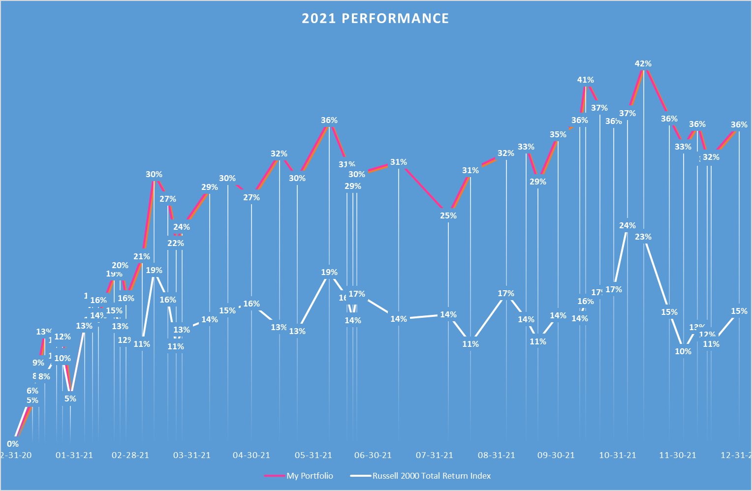
Whatever the case, I’ve noticed in the past that my portfolio of scruffy value stocks often does the best when we are coming out of a downturn and so perhaps it should come as no surprise that 2021 was an excellent year for my own portfolio as well. When the dust settled, I finished the year up 36%, a full 21% ahead of the benchmark Russell 2000 index.
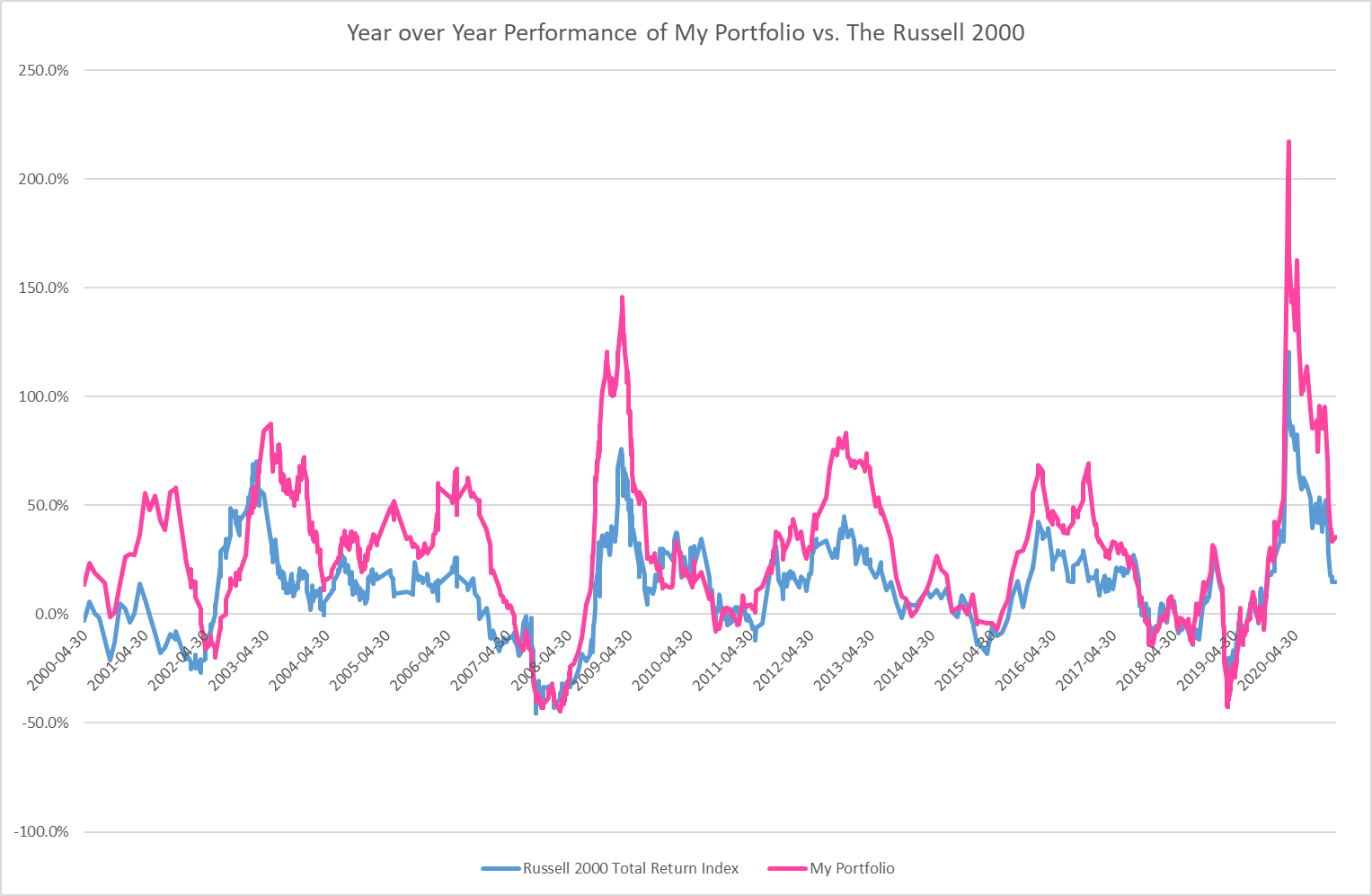
And the longer term perspective… Flourishes of brilliance interspersed with uncomfortable periods of mediocrity.
The Growth Juggernaut Wobbles
It’s been a tough decade for value investors. Usually we can sit back, comfortable in the idea that value priced stocks tend to outperform their over-priced competitors by at least a few percentage points a year. But that hasn’t been the case for over a decade now. It’s been the longest stretch of relative underperformance of value on record. As we head into 2022, though, the price action of the value and growth indexes is encouraging. Could there be signs of light at the end of the tunnel for value investors?
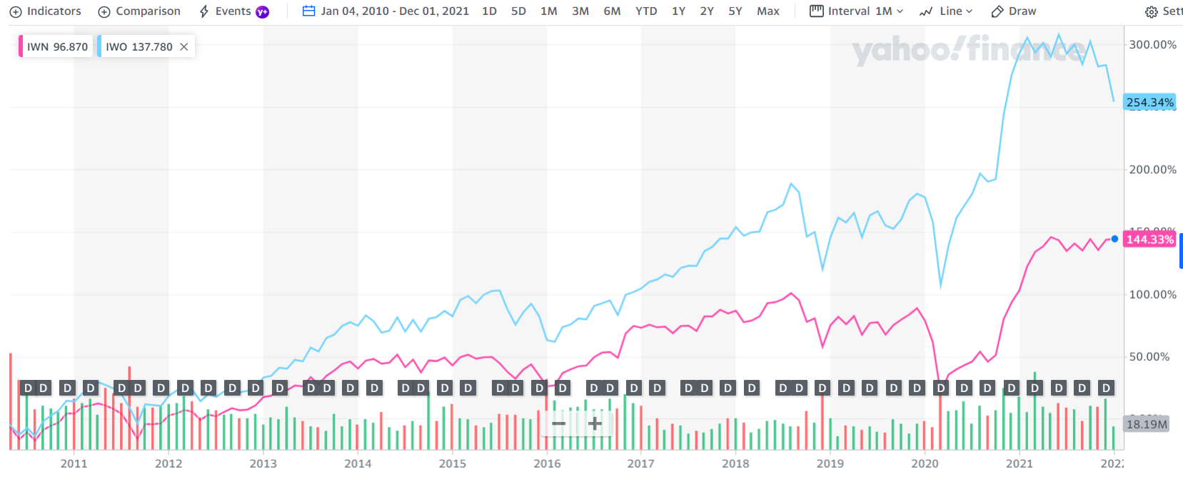
If you look at the graph of the Russell 2000 value index (IWN in pink) vs. the growth index (IWO in blue) you can see an interesting convergence at the far right of the graph. Growth names have been taking it on the chin lately while the value names are holding their own. Is the market just toying with us, or could a paradigm shift be underway? We’ll find out.
Visions Of Algorithms Danced In Their Heads
Meanwhile, I have a big project this winter that is going to keep my mind off the day to day gyrations of the market. My personal investment portfolio has undergone a major evolution over the past several years. I’ve moved more definitively into the investing mainstream, investing in larger companies and embracing the US market where over 50% of worldwide trading action takes place. It’s been a scary transition at times. I feel more comfortable in the over-looked backwaters of the market, away from the neon lights. But I believe there are value opportunities even in this more brightly lit market. And importantly, the US market and the larger, more heavily trafficked stocks it contains offer scale.
The US market is a monster. There are easily 10 times as many operating companies in the US as there are here in Canada. (And that’s even before you include all those over-the-counter stocks which, as a Canadian RRSP investor, I’m barred from owning.) This doesn’t mean there are 10 times the number of opportunities, mind you, because the US companies tend to be bigger and more closely followed. But if you turn over enough rocks, you’re bound to find something.
The sheer size of the market, combined with the relatively recent emergence of reasonably priced data providers, offering comprehensive historical financial data going back decades, makes a spreadsheet nerd like me drool in anticipation. All this data promises hours of fun sorting and collating. This is going to be my big project for 2022.
My plan is to extensively overhaul the stock analysis and screening program I use, to fully incorporate this treasure trove of historical data. I’ve put this project on the back burner up until now because there were other things going on. A market crash and worldwide plague for instance. But now that things have calmed down, I want to roll up my sleeves and get to work. My hope is that all the number crunching will give me more insight into what fundamental levers drive the market. With 5000 stocks and 30 years of history, there are a lot of data points to work with.
Up until now, I’ve gotten by quite well with a few rough guidelines, courtesy of Peter Lynch. I’ve slotted companies into one of three very broad categories: no growth, average growth and high growth. I’ve also made some adjustments for debt levels and company size. It’s a sort of poor man’s discounted cash flow analysis that I’ve used. Instead of getting all fussed on the details, I’ve relied on some pretty simple rules of thumb. If a company is on track to double in size over the next few years, for instance, then it’s probably worth about twice as much as one that isn’t.
But maybe with some heavy horsepower behind me, I can add a bit more nuance to my valuation framework. The ultimate goal would be to hard code a valuation algorithm that was actually somewhat predictive of future returns. I’ve tried this in the past and failed, partly I think because I haven’t had the breadth of data I need to make it work. And partly too because I haven’t made the effort. But I know after 25 years of investing with fairly impressive market-beating returns to show for it that my brain probably has that predictive power I’m searching for. All I need to do is reverse engineer what it is I am thinking as I evaluate a stock and code that. Easier said than done. But it will keep me busy.
If I make any earth-shattering discoveries, I’ll let you all know.
In the meantime, I’m going to try to cut back a bit on the length of my portfolio update posts. I seem to end up writing a mini novella every time I buy or sell a stock. That seems excessive and takes me away from the more important work of finding the next stock to buy. So I’m going to try to put those kinds of posts on a diet. Like all New Year’s resolutions, I don’t know how well I’ll be able to stick to that. But if my next post is: “Bought Acme Corp ‘cause it was cheap.”, you’ll know why.
All My Children
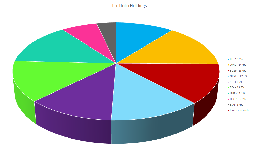
In that spirit, I don’t have much new to say about my current spate of portfolio holdings. I own 9 stocks right now. 4 in the US and 5 in Canada. A couple of the Canadian holdings are smaller due to liquidity constraints but conceptually, I love all my current portfolio children equally. I think they are all comfortably undervalued and could all deliver strong gains in the right set of circumstances. It’s a fairly well diversified portfolio, especially for one with only 9 companies in it. I’ve got exposure to retail, technology, manufacturing, resources and services. I own a couple of micro-cap companies, several large cap companies and a few that fall somewhere in between. The companies I own run media campaigns, they manufacture farming equipment and auto parts, they provide extra warehouse workers at Christmas time. They sell sneakers, drill for oil and gas and make pressure treated lumber so their customers can host backyard BBQs for the neighbourhood. They engineer the latest in 5G wizardy, make electric transformers and build power plants. Some of these companies are turnaround plays, some offer the potential for higher growth and some of them are just ticking along at a slow but steady pace.
The theme that unifies them all is that the share price does not fully reflect their long-term fundamental value. In my opinion at least. If I’m right, I have faith that I will ultimately be rewarded for my insight. If I am wrong, well, where else am I going to put my money?
Good luck in 2022.
Full disclosure: I own shares in Footlocker, Omnicom, BGSF Inc., Qorvo, Stella-Jones, Enerflex, Linamar, Hammond Power Solutions and Essential Energy Services.